Interview with Colour-loving Interior Designer Maria Chandler
Based local to us in St Albans, Hertfordshire, Maria Chandler is an Interior Designer and the founder of BECOME Interiors, an Interior Design Studio that aims to bring characterful and joyful interiors to people's homes. With a love of colour, nature and a vision that totally aligns with ours, we thought it would be great to get to know her a bit better!
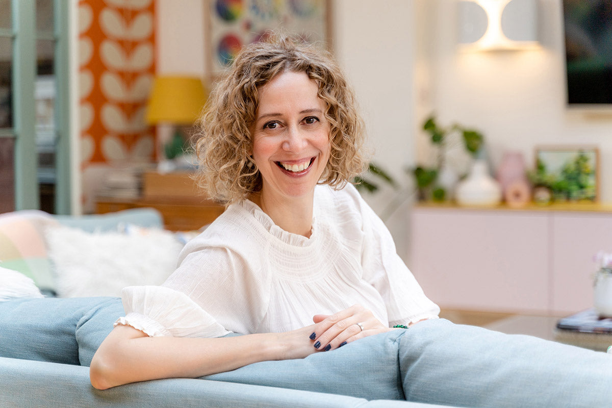 Photo: Stephanie Belton
What inspires you and how do you approach new projects?
Every new project is inspired by my clients and so will start with a Design Brief meeting where I spend time getting to know them - to understand what inspires them, their background, the wishes and must-haves for their space, their taste, their preferences. It's all about unpicking this detail, so that anything I propose going forward is client-focussed and ultimately, results in interiors that reflect them. I then create a design concept for the project, which articulates the look and feel I aim to bring to their spaces - so, the palette, shapes, patterns, textures and objects that would be found within it.
I am a huge colour-lover and heavily inspired by nature, so this plays a big part at informing my proposals. I spent lots of time outdoors as a child and I think that's where this fascination stems from!
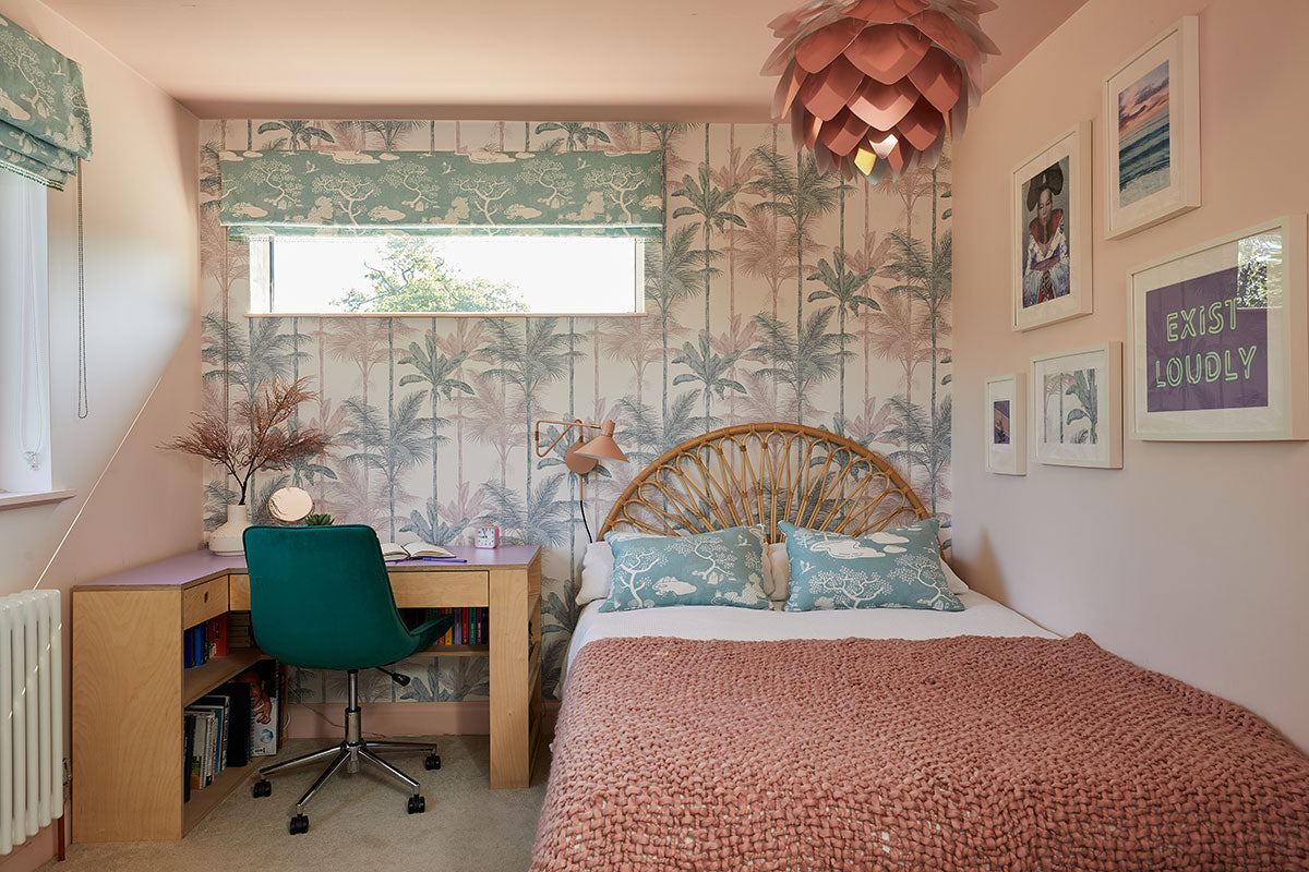
You chose to use Safomasi fabric for the teen bedroom in your Mid-Century project. Can you talk us through the process of designing this room?
I love working with teens - they're at a stage where they're developing their taste, exploring the world and wanting to make a statement. The wonderful young person on this project is into the arts and really creative - they wanted their room to inspire their creativity and be transportative and imaginative.
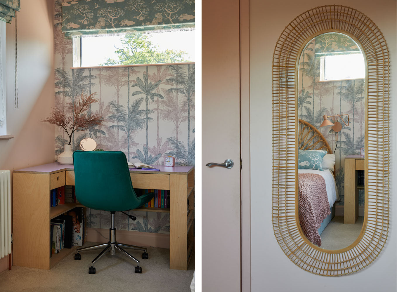
As a huge Bjork fan, they specifically wanted to feature a coveted poster within the scheme, so this was one of my starting points. In the poster Bjork wears a kimono and the background was a delicate oriental pattern, so I took this thread and wove it into elements of the space. I'd been following Safomasi for a while and love the way your pattern is based on story-telling and your travels around the world, so thought it was a perfect fit for this project. Thankfully, my client agreed and I think it sits beautifully within the scheme.
Mixing prints and patterns is something a lot of people struggle with. Do you have any tips for doing this successfully?
This can be quite personal - I work with some clients who love print and pattern, whilst others really want no pattern at all. This can be tricky to navigate as a designer who loves bold layers of pattern and colour! I tend to use patterns that contain at least a couple of colours from the project colour palette. I'll often balance a bolder pattern (say a floral or abstract one) with something more geometric (say a grid pattern or stripes) - I like the juxtaposition of natural versus architectural design.
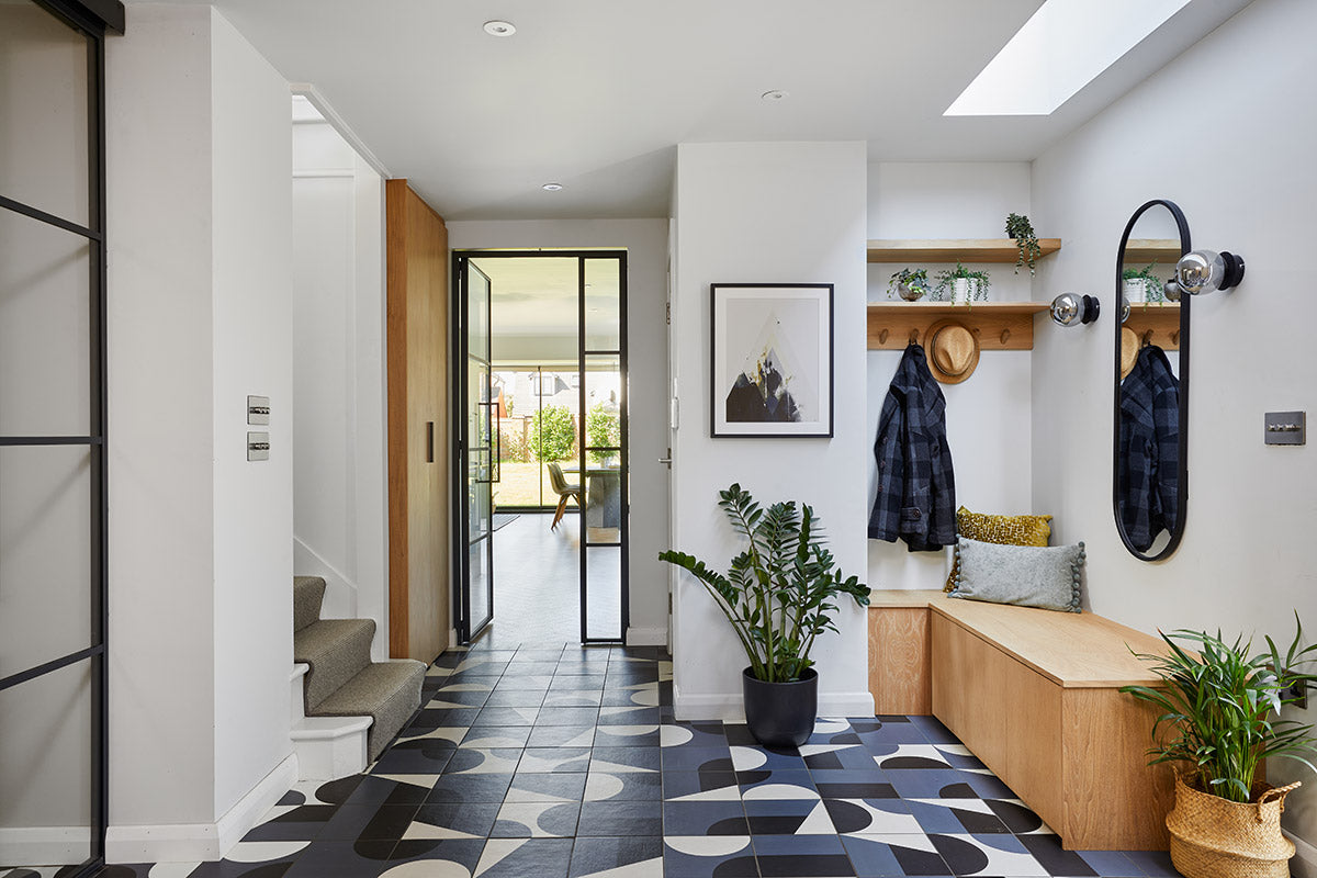
As a colour-lover what are your favourite ways to incorporate colour into a scheme and how do you encourage clients to be braver in their choices if they don’t feel that colour confident?
I love it when my clients are brave and would love to do more bold, colourful projects, but many people reach out to me because they want help finding that confidence. In this situation, I generally encourage these clients to go safer on their high-ticket items, say their kitchen or main sofa, then add layers of colour in the elements that can more easily be changed - so paint, wallpaper, soft furnishings and accessories. Even a bold accent chair or footstool can make a huge difference to your space, injecting a pop of contrast into the room.
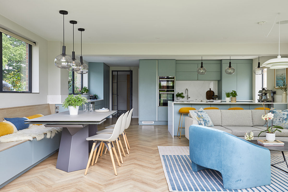
What makes a joyful home?
One that welcomes its owners from the moment they walk through the front door - not only does it need to look good and feel characterful, but it must also work well for the lives lived within it. I strive to achieve this balance on every project by looking for ways to introduce great storage, wonderful pockets of light, a balance of open spaces and cosier nurturing nooks...and ideally a view of the garden if you have one! Feeling that connection with the outdoors is super-important to many of my clients.
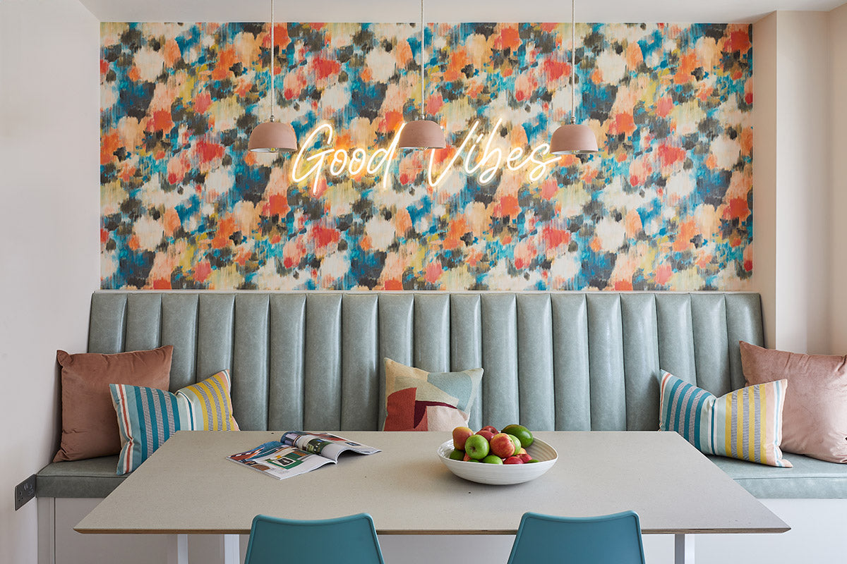
How would you describe your own home?
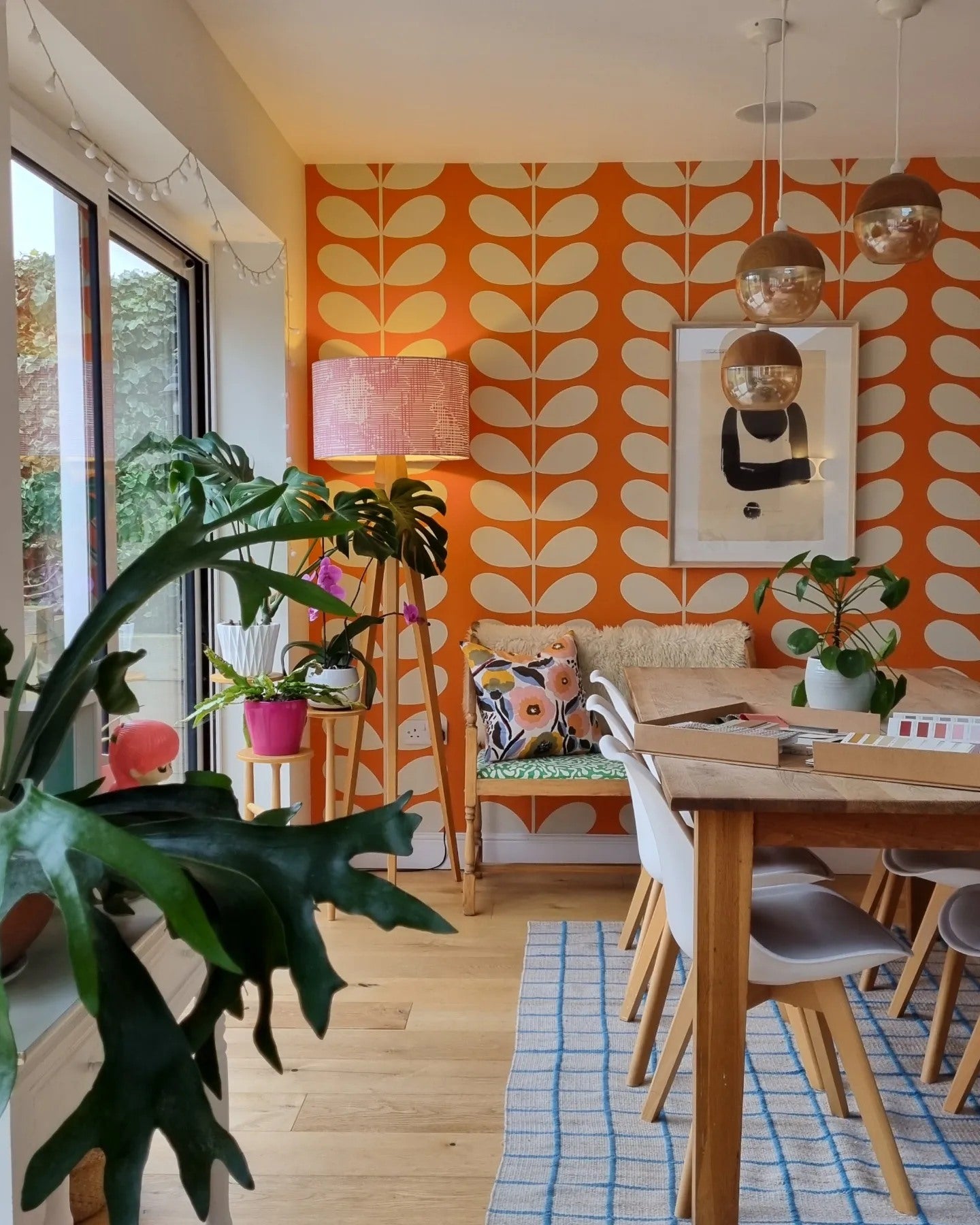
Welcoming, informal, cheerful...colourful! I hadn't officially become an interior designer when we bought this house, though I had designed several of our own homes previously. We live in a mid-century suburban semi, in an area full of mid-century suburban semis, and since it is intended to be our forever home, I was very keen to ensure it felt unique and characterful with elements of 1960s references.
I was particularly drawn to the bold, colourful elements of this era and so, you will find oversized orange patterned walls, bold yellow pendant lights, a pink media unit, a moody blue room and more....all balanced with slick wood floors, some pale walls, natural wool carpets and, of course, a wonderful view of the garden!
What are you working on at the moment?
Oooh, I'm juggling several projects at the moment. Nearby, I'm working with a lovely local couple on their late 1800s property - one element that's exciting me is their Living Room. They love the great British countryside and have a particular passion for reading, psychology, crystals and the natural world. I found our design brief session so inspiring and have visions of a library- come apothecary-style space in my brain...so we'll see how that develops!
Another is with a seaside-loving couple, to design their new master bedroom suite to encompass a hotel-feel, whilst ensuring its super-cosy and inviting. A luxury escape for the adults - I may never want to leave!

Thank you Maria!
To see more of Maria's work visit becomeinteriors.co.uk or follow her on instagram @become_interiors
Interiors in all images by BECOME Interiors
All Interior Photography by Chris Snook (except last 2 images)
Portrait Photograph by Stephanie Belton

 Interiors: