

Design Process: The Making of the Fells Print
In our journal post last week we interviewed Snuggle Truffle founder Eleanor Tweddell and introduced The Fells, a print inspired by the Lake District designed for Snuggle Truffle. This week we’re sharing more about the design process and how we interpreted Eleanor’s vision to design a pair of colourful prints.

Inspired by the Lake District
For our collections we always travel for inspiration, but this time the process was a little different. Although we’ve been to nearby regions, we hadn’t explored The Lake District, so our aim was to design a pattern that included elements of Lake District life important to Eleanor and resonated with others that knew the area. Eleanor sent us photographs and images, and we Skyped to talk through ideas.

Design Process
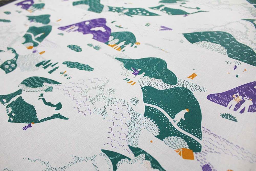
From our conversations and research we had formed a pretty clear picture of how the design could take shape. The Estuary Walk print from our Salcombe collection was a reference for the style of pattern, a bold, large repeat with lots of illustrative details. Before starting on the design we wrote a description of features we would include; people hiking, camping, painting by the lake shore, sheep grazing, stone cottages and a viaduct with train winding though. We worked on various compositions and shared a rough first draft with Eleanor.
“We spent about an hour on Skype talking about the Lake District and the things I associate with it. Sarah scribbled away, and I could tell she had started to form a picture in her mind. After the call, a few weeks later she shared her first illustration, it was stunning and I was impressed by how close it was to what I had imagined when I first had the idea. The level of detail and imagination was brilliant.”
– Eleanor Tweddell, Founder, Snuggle Truffle

From this first sketch we refined the design further, taking out the viaduct which turned out to be too dominating and replacing it with a stream and stone bridge. Then we drew in all the fun details and made sure it was repeating properly.

As all our products are reversible with a different print on each side we designed a single colour pattern to complement The Fells print. Tash Mok, our intern at the time, did a great job sketching out compositions for various ideas, and we went forward to develop ‘Hill Walkers’, a playful pattern of hikers out exploring.

Sampling the design
With sign-off from Eleanor we made the screens to hand screen print the final designs. The Fells is a 10 colour print, which meant 10 screens, one for each colour, and a lot of precision to get the colours and screens exactly right! After doing a test print to make sure the screens were aligned and the pattern repeating properly, we worked on perfecting the combination of colours.

Hand screen printing
After sampling we were ready to print the full run of fabric, all 10 layers...


The Final Product


